I received an email from somebody the other day who’s learning the basics of flexplot. Here’s her question:
I have time series data for reading achievement at four school grades. I am fitting nonlinear latent growth curve models to map reading achievement over time.
In order to plot these data using flexplot (in R), I have cheated a bit by making the time points one variable and the reading achievement data a second variable. The idea is to plot the data points over time, along with the means and SDs.
So this works fine, flexplot reads the timepoints as categories and gives all the data points (jittered) plus means and SDs at each time. I was just wondering whether it is possible to join up the means at each timepoint in a horizontal line so that the nonlinear trend is clearer?
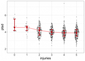
The beauty of flexplot is that all flexplot graphics are ggplot2 objects. Sooooo…..
All one has to do is figure out how you would do that in ggplot 2 and layer that onto the flexplot object, like so:
require(flexplot)

require(ggplot2)

data(avengers)

### convert injuries to factor (just to fit your example)

avengers$injuries = factor(avengers$injuries, ordered=T)

plot = flexplot(ptsd~injuries, data=avengers)

plot + stat_summary(fun=median, colour="red", geom="line", aes(group=1))
And you end up getting a lovely plot, like so: